The Starry Night, 270 :: home :: |
Dust.
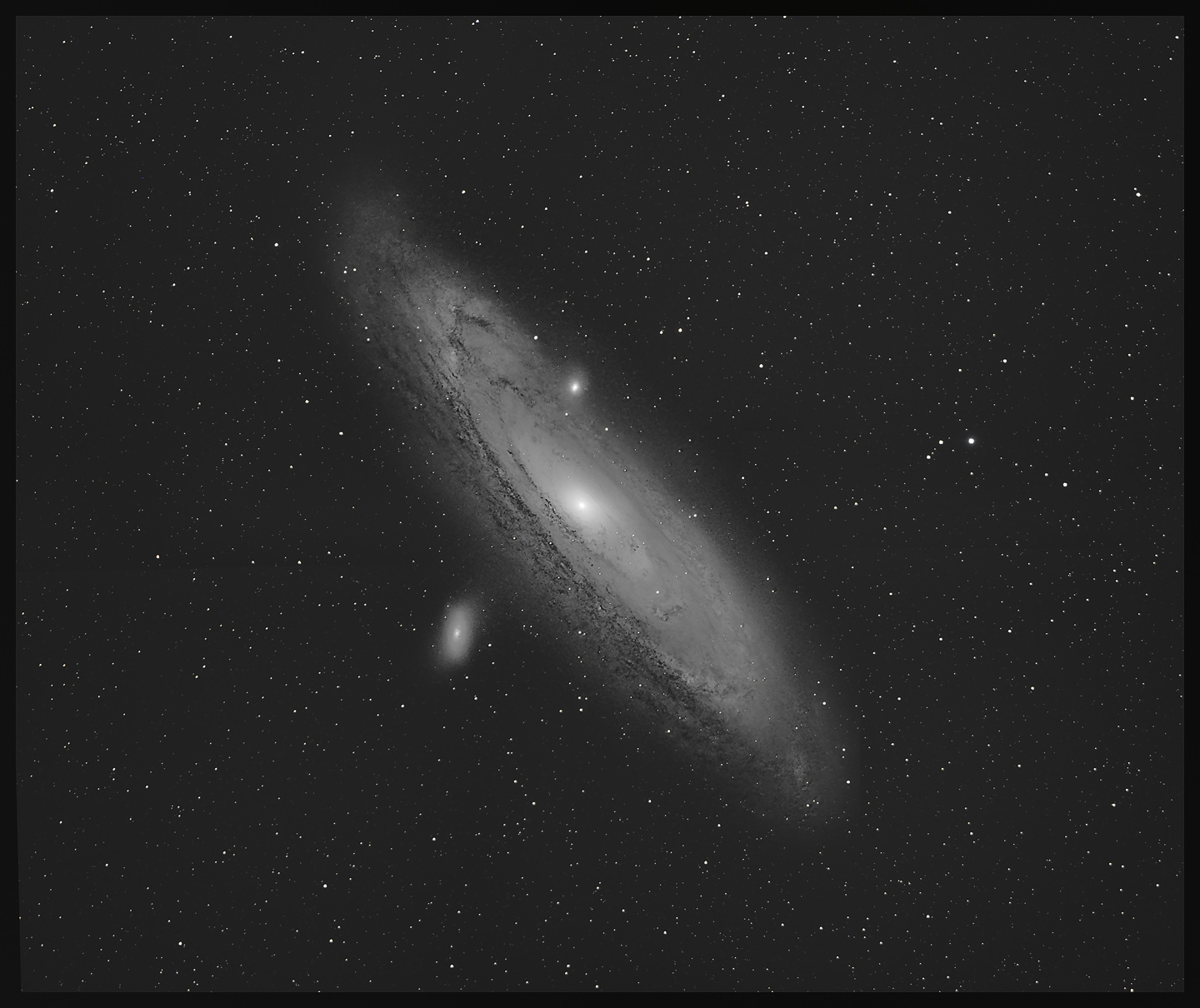
I've presented this field rotated 180-degrees from the usual orientation because (to me) this gives the photo a compelling "depth" by making it easier to appreciate what's going on. The vivid dark structures must be nearer to us than the great mass of stars in the galaxy since we see them silhouetted against those accumulated billions of suns; so that's the near side. We're looking "down" at an angle on a circular platter of maybe a trillion stars 100,000 light-years across. The same lanes of dust and dark gas continue all the way around, but tides of stars flood the intervening space and hide the dark lanes on the far side of the galaxy. If I make this image big and stare at it for a while, I get a clear sense that the disk is twisted: the view of the left side of the disk seems"flatter" while the right side is seen at a slightly steeper angle. There's a faint twist to the farthest extensions, too, and there is the faintest trail of stars from M110 looping back toward M31. I processed the foreground stars (4 panels, 10x30s) independently of the galaxy. I used Russ Cromen's BlurX to tighten up the stars, then used them to register the northern and southern halves of the photo. Then I used Starnet2 to remove them entirely and processed the galaxy by itself. I put a few stars back to use in aligning the galaxy with the 4-panel photo of the foreground stars. Issues: one night's take of M31 was at -6C rather than -15C, but with matching dark frames, that hardly mattered. I have yet to get color data to cooperate. I suspect my sky flats are introducing a hard-to-fix color cast, and since the northern and southern fields are shot hours apart across three nights, variable haze and local light pollution may have a nasty effect. I'm thinking I ought to just go out and shoot color data; maybe the 105mm data can be used; or maybe I can pick a few frames made within a few minutes of one another, kill the color in the flats, and go from there. Always another adventure. Yes, that worked: rendering the flat in grayscale makes all the difference. The other notions may help, but the key is to debayer the flat, run SCNR to dump the excess green, then convert to grayscale before using the flat to calibrate other images prior to debayering them. Keep in mind that the point of the flat-field is to correct uneven illumination; any influence it may have on color is probably not good. Here's a trial run against 100 subs:
This is going to be fun. Tomorrow.
2025/01/06. I'm going to leave this here for the moment. I've gone blind to what the image actually looks like -- too much staring, adjusting, tweaking. Eyes and brain need to take a break. Here's what I have so far:
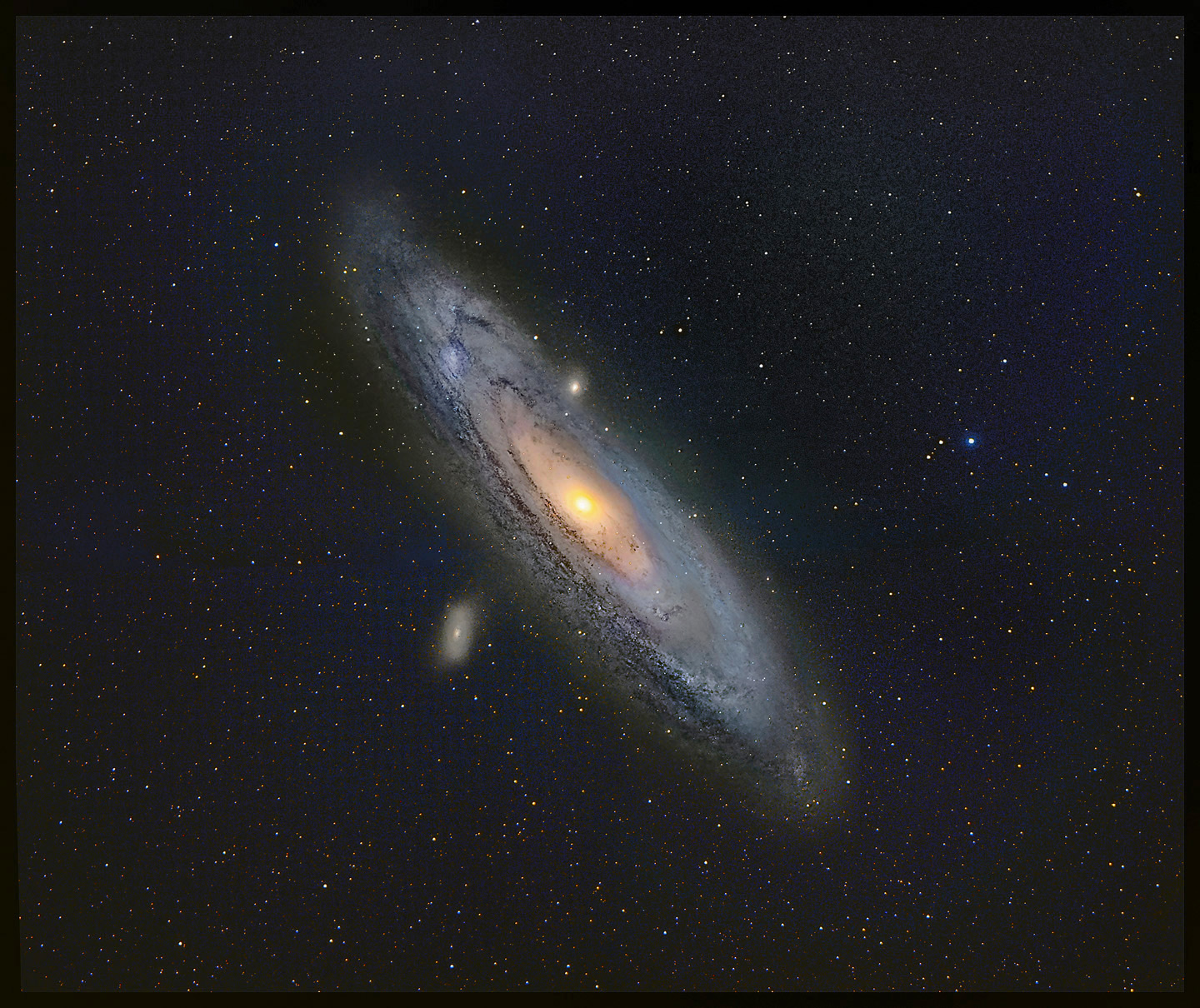
Astrophotographic aesthetics need to be attended to. When I posted the b/w version (top of this page) on Facebook, one of the comments (hi, Jeffrey) held that it was in some ways preferable to a full-color rendition because the b/w image more closely resembled how M31 looks to the eye in binoculars or telescopes. Nevertheless, I prefer the color image. Don't get me wrong; a good b/w astrophoto is a thing of wonder; I'm fine with them, enjoy them, am challenged by them. Alan McClure was my guru; Ansel Adams would have loved this stuff. But I think astrophotographic aesthetics (hereinafter AA) is significantly different from the aesthetics by which other pictoral photography is often mearured. If I go shoot Yosemite, Yellowstone, or the woods out back, there is some expectation that the photos should represent or at least pay homage to how it actually looks (abstract imagery counts, too, but I'm talking pictoral or modestly impressionistic imagery here). In some, most, astrophotography, that constraint is not a binding sensibility. Most of the subjects of astrophotography are barely visible or totally invisible to the human eye. The point of astrophotography (and by extension, the principles that drive AA) is to reveal and to depict subjects which cannot be seen because the subject is too faint, too small, too smeared by atmospheric turbulence, too hidden by extraneous light, or for various similar reasons is inaccessible to human vision. So what's the guiding principle? It can't (always) be to show a subject more or less the way it looks because an accurate depiction of "the way it looks" would very often be a black rectangle or at best a barely discenable grey smudge in a rectangle sprinkled with stars. According to my AA, the photograph must show what is actually there whether or not accessible to human senses. Colors may not (almost certainly cannot) correspond to what the eye does see but must represent some aspect of reality (that is, if detail A is depicted in red while detail B is depicted in blue, there must be some actual difference between A and B which causes their photographic images to appear in those colors; if is some physical reason for the light they emit or reflect to differ, then that difference can be exploited to depict that physical difference). A more homo-centric principle would hold that the colors in the image should represent what the human eye would see if it were more sensitive than it is. I regard this as a useful but generally excessive constraint on AA. There's nothing special about the way the eye maps color into mental perception. Holding that one counterfactual (this is how it would look "if the eye were more sensitive") is more legitimate than another (this is how it would look "if we saw the light of hydrogen-alpha as blue") seems arbitrary. All this needs development and explanation. But it doesn't necessarily need it right now. There's stuff to see. And more to photograph.
:: top :: |
© 2025, David Cortner